Petco, Winning Pitch
Droga5 / Full-time, 2018
Petco has been making strides to differentiate itself from its competitor, Petsmart. While the company has brand recognition, it both looks and feels very similar to Petsmart — they use the same color palette, photo treatments, and sans serif typography. Even their own employees conflated the two companies.
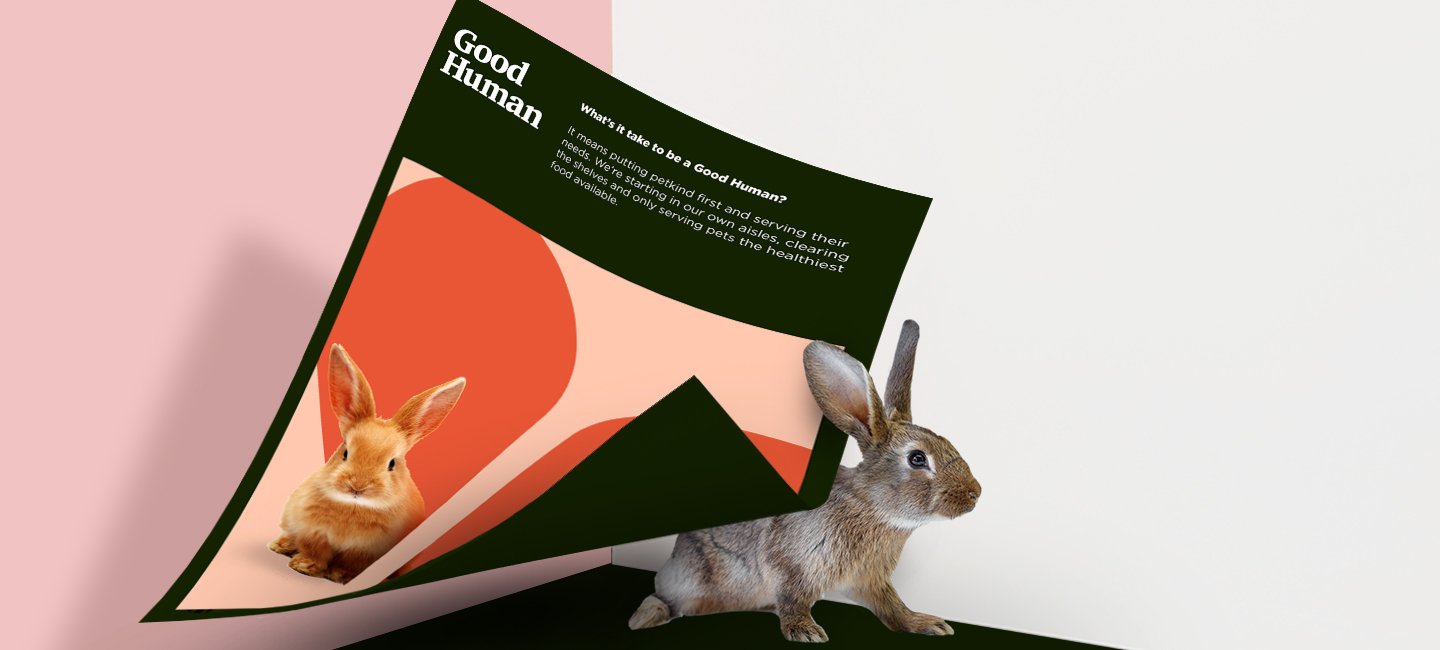
Petco wanted to put itself ahead by introducing a health-first initiative for all types of pets. By 2020 they’re removing any and all products and food that have any questionable ingredients in them.
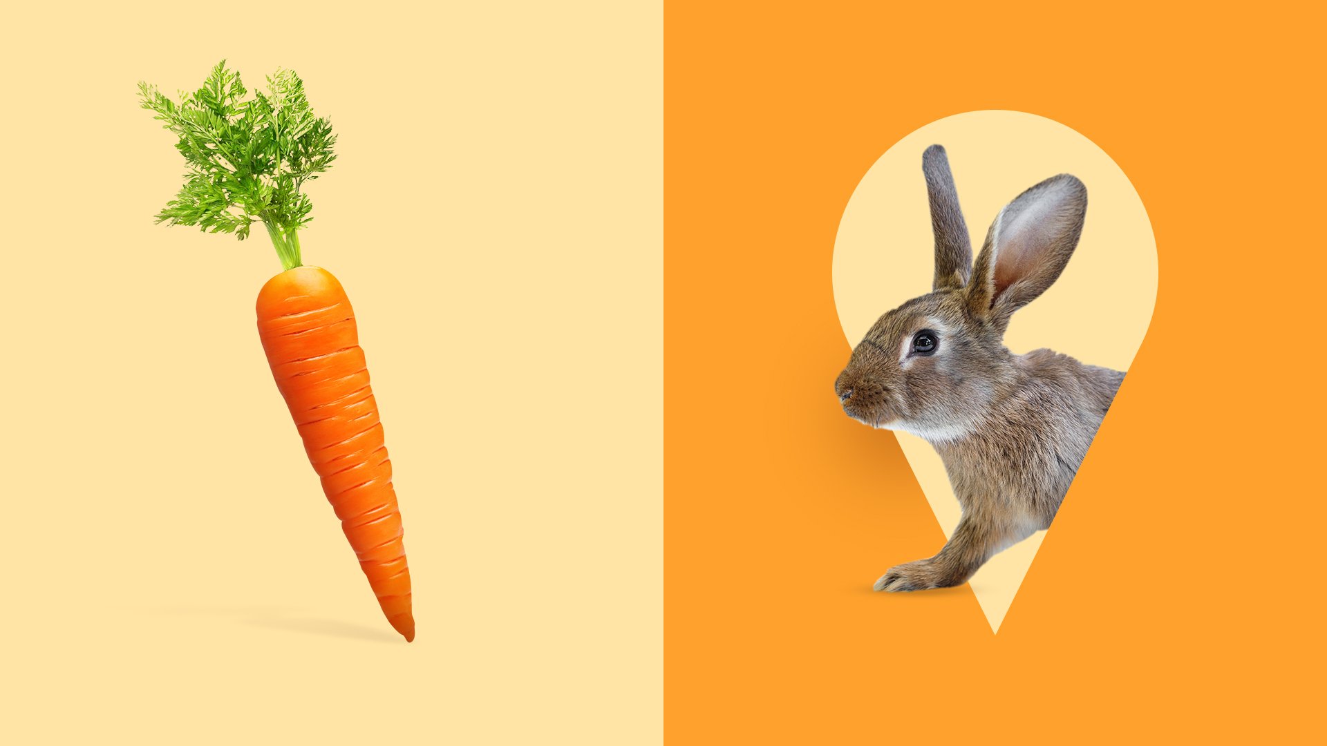
We were tasked with creating a campaign that not only celebrated their health initiative, but also create a brand that looked entirely its own. Using their current line “Where the pets go,” we updated it to “where the good humans go” making even the language pet-first.
Role
Design Director
Tasks
Design, Design Direction, Branding, Art Direction
Team
Designer: Albie Eloy
UX Designer: Jenny Clark
THE RESULT
The result of this work was that Droga5 as a company started doing pitches in an entirely new way. The process I established during this pitch tied creative and design work in a way it hadn’t previously. Since using the process I established in this pitch, as well as using the deck I made as a template for narrative, D5 has won numerous pitches and introduced new design revenue stream opportunities.
A COLOR WORLD
In addition to differentiating the original color palette from Petsmart, we wanted a colorful world that was inspired by colors found in our pets’ worlds. It’s a color world, not a palette, so that any natural color could theoretically work within the system. These selected colors are not only ADA (human) compliant, but also animal compliant as well.
TYPOGRAPHY
Because Petco had recently purchased usages for Gotham, it was required we use it. To give it more personality, closer to personality and features of animals, Charter Black was paired with their existing type.
LOGO CUSTOMIZATION
Because the logo is no longer limited to specific animals, different animals afford customization for Petco members or those who create accounts. We updated the animal iconography to be more modern and maintained the original iconmark’s interconnected play between the dog and cat by creating different lockups of the animals in multiples.
PETCO APP
While Petco had an app, it was not integrated into their commerce experience.
To encourage owners to be “Good Humans,” we suggested an app that amalgamated pet households, tracked all paperwork, and gave “good human” points to those who used the app regularly, took their pets out to Petco, and bought healthy food for their pets.
INTERNAL LOOK & FEEL
RETAIL LOOK & FEEL
MARKETING


