Harley–Davidson
Droga 5 / Full-time, 2019
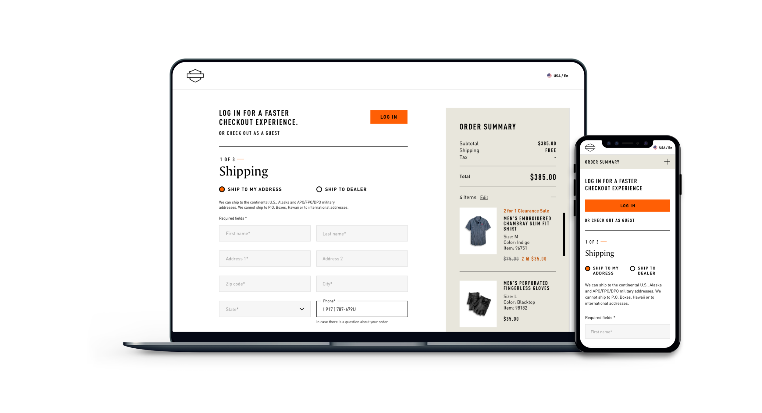
Harley-Davidson came to Droga5 for a brand and website redesign. The website was an ambitious undertaking with originally 6 sprints run in an agile process. The launch had to happen in January of 2020, with a complete international roll out by summer of 2020. The design ask was to reskin the existing AEM-built site on a component level, fully AA compliant, and create net new for the eComm experience.
This website redesign process can be broken down into several parts: 1) the original design, 2) the grittier update, and 3) the redesign of the redesign.
Role
Design Director
Tasks
Design direction, Quality control, Orchestration
Systemization
When a new Global Brand President took over at H-D, our objectives and design changed. He wanted to lean into the existing audience and play up the heritage of the brand. As we were already starting to design the site, this meant figuring out a way to implement changes with the least lift for development.
The easiest change to make was using less of the Amerigo and tightening the tracking of DIN.
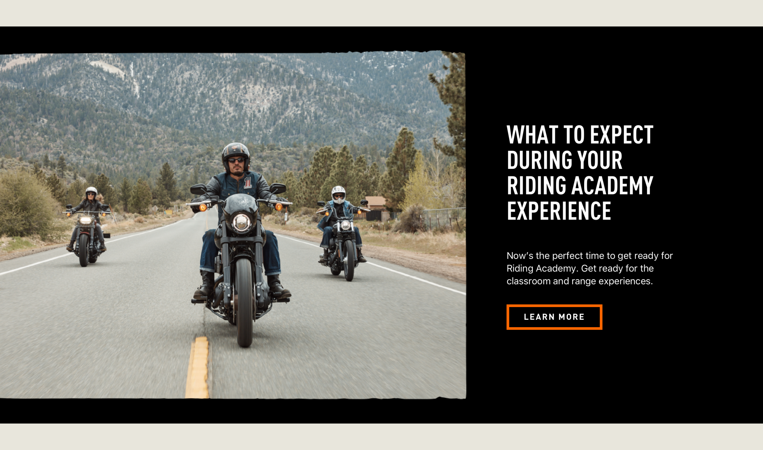
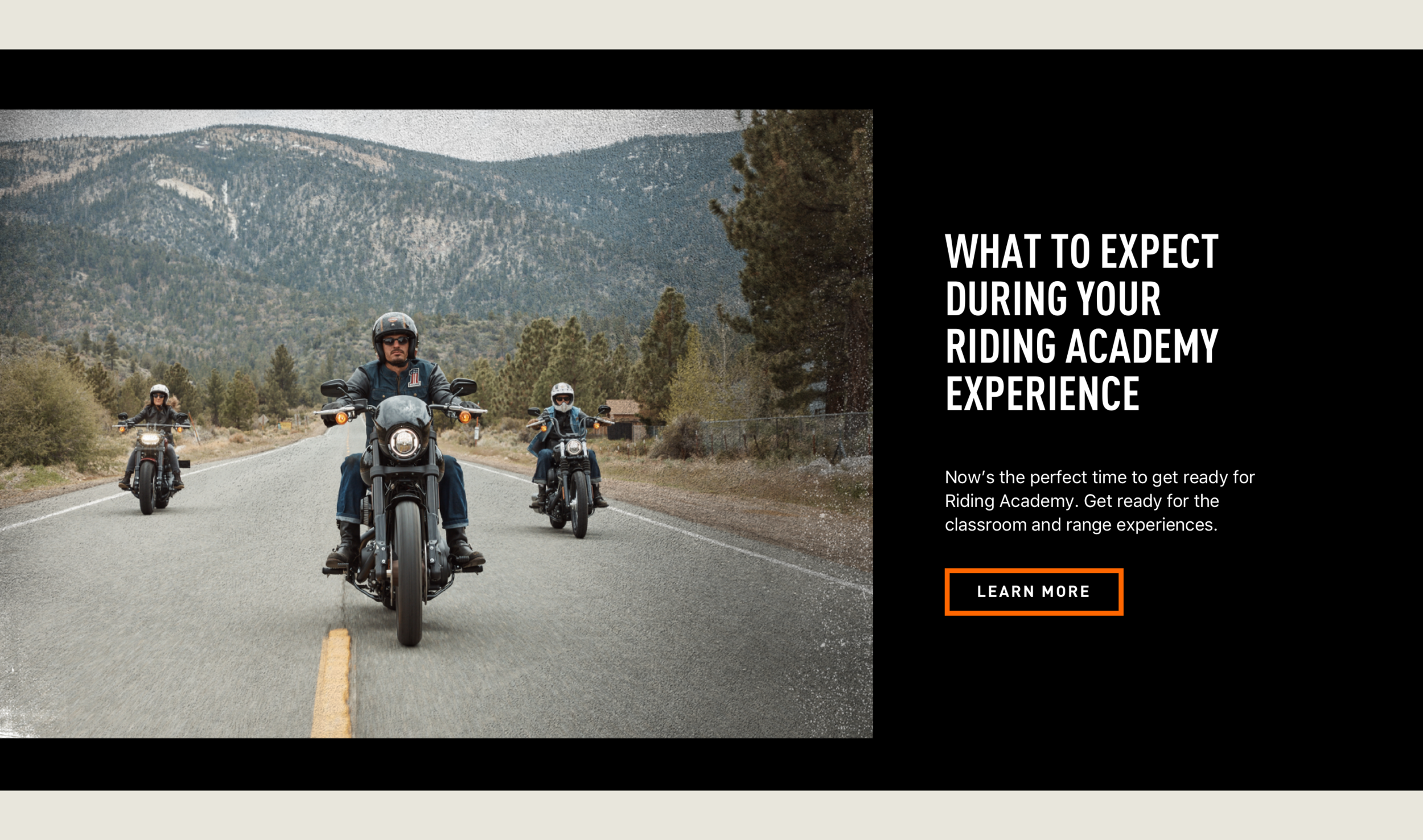
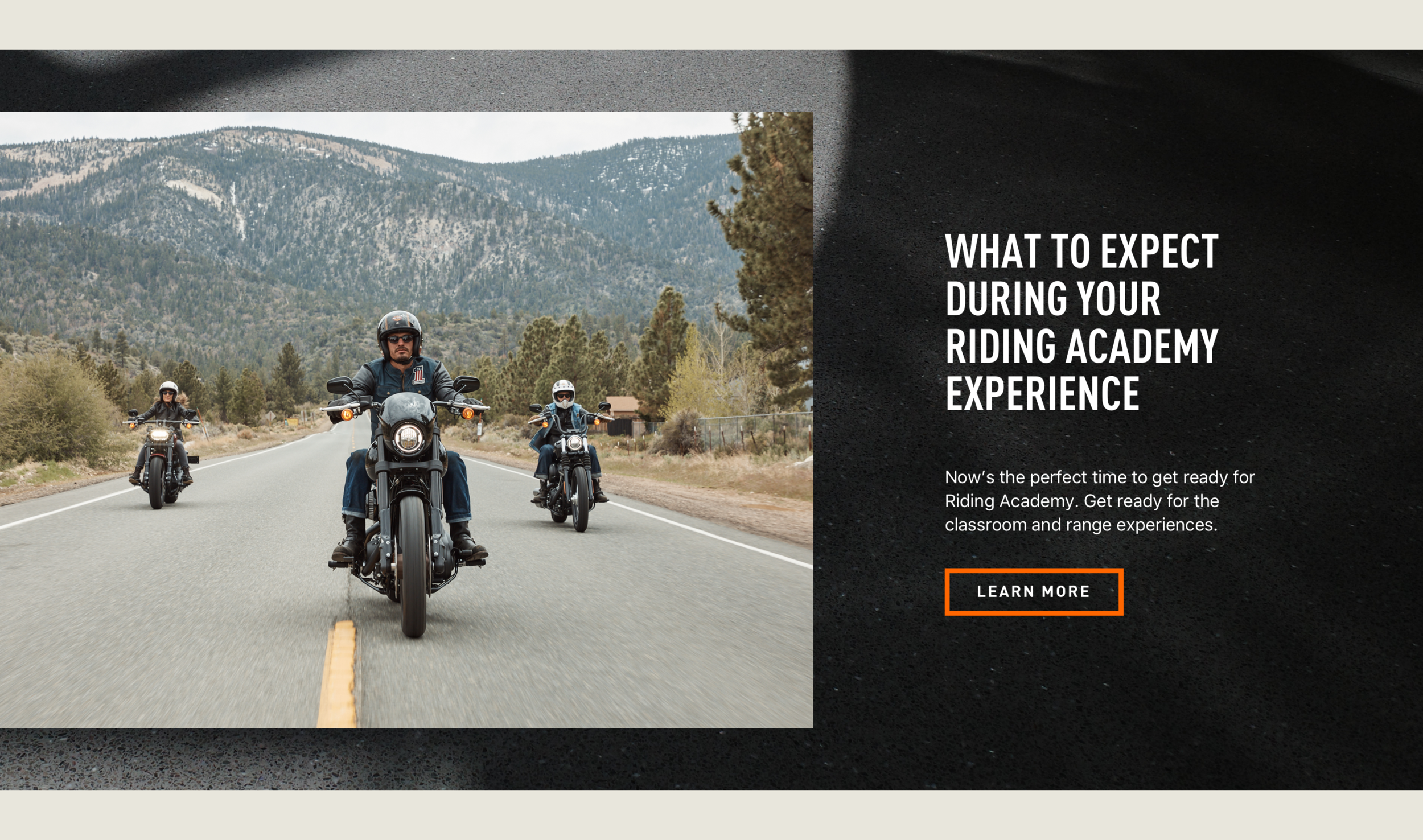
There was also ADA compliance to adhere to — something grit and layered doesn’t necessarily work with. Our solution was to pick and choose when to apply grit depending on the context. There were 5 opportunities for applying grit: torn edges between components, torn edge frames around imagery, textural photography assets, textural backgrounds, and adding a secondary palette.
Whether cleaner editorial or more “gritty” patterning is desired, a layered approach allows anyone working on the site, designer or non-designer, to customize the layout to the needs of the page while still being AA compliant.
Discovery
The original ask was for a new design that spoke to a newer audience beyond the Harley archetype, older white man who generally favors leather and a lengthy beard. The design, therefore, was much more modern with a balance of negative space and alluring photography — all stemming from the insight that the clarity you need can be found on a bike, blurring past your problems.
The H–D brand team at Droga5 created a strict palette of three primary colors: black, white and orange. In print this worked well, but in digital we needed the flexibility of secondary colors. This gave us the opportunity to explore more “gritty” coloring. Our palette was color-picked from vintage paraphernalia in H–D’s archives.
Results
The site was rolled out to 170 countries in their respective languages. The challenge of designing a system that would work for every language while still adhering to the editorial approach of the overall rebrand was the best exercise of this endeavor in my opinion. After departing from the agency, the project continued to flourish. A restructuring of Harley–Davidson resulted in a new CEO who reverted back to the cleaner aesthetic now seen on their site.


